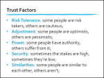
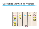
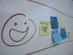
The first two workshops were a bit scary! (Well, for me they were.) As a…
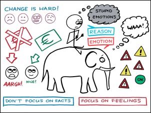
Workshop Visualization (#wallpaper, #noprojector)
I will be using a #wallpaper (#noprojector) approach during my Management 3.0 Workout workshops.
One discussion that keeps popping up among trainers and facilitators is whether to use presentation slides during a course or workshop. The traditional approach is to use them extensively, but a number of facilitators are in favor of a #noslides approach. Some of them prefer to write and draw everything on the spot during their workshops.
My own preference is to take a nuanced view between those two extremes.
I think, the question should not be, “Should we use slides or not?”
It should be, “What kind of visualization is the most effective?”
First of all, it is clear that lack of visualization is not an option. Conversations and learning are (usually) vastly improved when we visualize the things we’re talking about. The challenge is to find the visualization approach that best fits our needs and context.
#slides or #noslides ?
 Some of the benefits of #slides (when created with care) are:
- Consistent branding and good emotional potential
- Easily transferable to trainers and resellers
- Effort is in preparation; saves time during the event
- Easy to distribute among participants for note-taking
- Possibility for reuse on other distribution channels
- Easy to validate for accreditation and certification
 Some benefits of a #noslides approach, with all visuals created during the event, are:
- Easier to improvise and just go with the flow
- More personal from the perspective of the facilitator
- More hands-on and engaging for the participants
I’m sure I missed a few benefits, but you get the idea.
 I like the idea of not using presentation slides. My only issue with the #noslides approach is that its evangelists emphasize the benefits of drawing-on-the-spot without explaining how to compensate for the loss of the benefits of having well-crafted slides. When all you do is draw on a board in the room, how do you enable a colleague to facilitate the same workshop? How do you enable participants to add notes to your visuals? How do you show an accreditation committee which topics are covered by the courseware? Etc.
#wallpaper or #noprojector
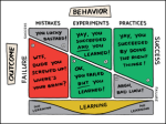 As I said, I like the idea of not presenting during a workshop. I certainly appreciate the ability to improvise, and I also agree that clicking through slides can be boring for some people. However, I want the benefits of #noslides but without losing the benefits of #slides. That’s why I use a #wallpaper (or #noprojector) approach during my new workshops.
The #wallpaper (or #noprojector) approachs means I still prepare slides, but I don’t project them from a computer. Instead, I have a stack of printed materials, and together with the participants I decorate the room with my wallpaper. The printed papers are optimized for viewing across a room and for being mistreated in any way we like.
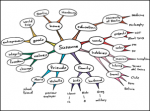 With this approach, I still have all the benefits of slides (branding, transferrable, preparation, note-taking, reuse, etc.). At the same time I also have the ability to improvise. I can show and discuss the wallpaper left-to-right, right-to-left, up-down, down-up, all at the same time, or I can tear them up and even fling them out the window. Try that with your presentation computer!
Furthermore, participants can scribble on the slides (when not yet ejected from the window), decorate them with sticky notes, take photos, and review/discuss them in any order throughout the day. I’m sure this is more engaging than staring at a projector screen for hours.
As a side-effect, I won’t have to worry about a failing computer, a broken presentation clicker or dysfunctional Wi-Fi. Now I only worry about wall space and LOTS of tape.
What do you think?

