Those who've read my #Workout book are probably familiar with the 12 principles for metrics…

How to Measure Your Team’s Performance: The Scoreboard Index
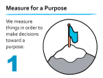
How do you measure performance?
How can you visualize improvement?
I designed a simple new practice for measuring and visualizing performance and improvement, both at the personal level and at a team level. I call it a scoreboard index. It somewhat resembles (and borrows from) OKRs but I changed things to make this practice better suited for me and my team.
This is what I need:
- I need a tool that enables a weekly evaluation of how well my team and I are doing, in different contexts, so that we can reprioritize our efforts iteratively, using real data.
- I need a simple practice that doesn’t cost me much time and that is neutral towards specific measurements, so that we can decide to change metrics whenever we want.
- I need a visualization that is easy to comprehend and that allows people to see at a glance what overall improvement looks like and in which areas they are underperforming.
This is what I do:
I define a few qualitative objectives, such as “more engagement among customers” and “more activity on the website”, for myself personally, and for each team or crew. There should be only a few objectives at any moment. Stay focused! You can’t optimize everything all the time.
I define a few quantitative metrics per objective, such as “page views per week” or “blog comments per week”. Each objective has between two and four metrics because it’s good to look at an objective from different angles. Try not to rely on just one metric!
For each individual metric, I define two lower bounds and two upper bounds: 1) the number at which I would feel “devastated”; 2) a number that would merely make me feel “unhappy”; 3) a number that would make me feel quite “happy”; 4) the number at which I would feel “ecstatic”.
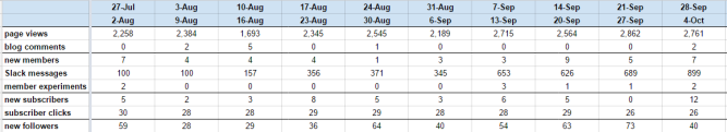
For example, the Happy Melly website now has a modest 2,500 page views per week, on average. If it ever dropped to 1,000 per week, I would be unhappy. If it crashed to 500, I would feel devastated. However, when it climbs to 5,000, I will be happy. And when it shoots up to 10,000 page views, I will feel ecstatic.
Obviously, these lower and upper bounds are subjective choices. But that doesn’t matter. What I need is a range against which to evaluate my performance as a worker, or our performance as a team. And that evaluation is always subjective.
The next thing I do is to check all numbers on a weekly basis. Of course, I may want to monitor some things on a daily basis, and maybe some data is only available once per month. But I find that a weekly moment of reflection is (for me) just the right cadence for prioritization of work.
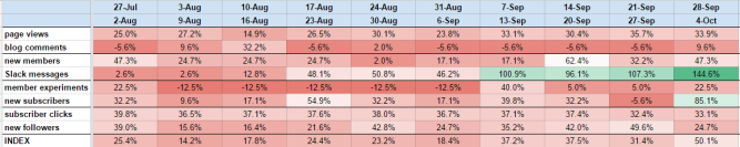
I convert each measurement to a percentage between 0 and 100. I use the lower bounds and upper bounds mentioned earlier to express every metric as a point between 0 and 100. Because I have two lower and upper bounds, I can do this twice, and I simply take the average of the two.
For example, when I have 2,761 page views, I can calculate that this point lies 44% between 1,000 (unhappy) and 5,000 (happy). It is also at 24% between 500 (devastated) and 10,000 (ecstatic). The average of the two is 34%. That is my score this week for the metric “page views”.
Naturally, I understand I can improve this approach by using an exponential scale instead of a linear scale. And I could use just one accurate scale instead of averaging two inaccurate ones. But what’s the point (pun intended)? I only want to know if I’m making progress. I’m not trying to publish a scientific paper.
To make the results visually interesting, I configured the spreadsheet to show cells in red when the numbers are low, and to show them in green when the numbers are high. The overall picture looks mainly red in the screenshot only because I’m using simple linear scales instead of exponential scales. It does not mean that we’re unhappy. {8-) The specific percentages don’t matter. What matters is: are they going up or down?
Last, but not least, I calculate a weekly index of the metrics. Having converted all measurements to points between 0 and 100, it is easy to take the average and call it my weekly improvement index.
Even better, I can plot the results with colorful lines in a graph, with the index shown as one thick black line. It is almost like a stock market, with one index (hopefully) showing a positive trend across the entire system.
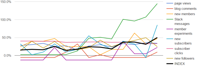
This is what I call a scoreboard index. I evaluate my performance with scores, depicted on a board, and turned into an index.
After the initial setup of the spreadsheet, the weekly collection of metrics and distribution of the results and index takes me only 30 minutes per scoreboard. Even better, the practice satisfies each of my three criteria: it enables weekly reprioritization of work; it is neutral towards specific metrics and it’s easy to comprehend the visualization.
I now have a scoreboard index for two crews and I will soon make another for myself. It is easy to imagine any startup or self-organizing team discussing their most important objectives and metrics and to ask one person with a knack for numbers to deliver a new scoreboard before the weekly planning session.
In another two blog posts, I will explain how this practice compares to the 12 principles of the metrics ecosystem, and how it is different from OKRs.
But for now, please tell me what you think.
How can we improve this practice some more?
Related Posts


Related Posts

GET MY FREE BOOK!
“How to Change the World”
GET MY FREE BOOK!
“How to Change the World”
  |